Charts
The Lost Opportunities dashboard helps you understand why calls failed.
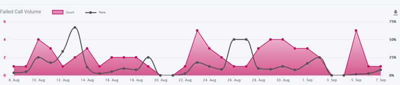
Failed Call Volume Trend
This charts displays the number of failed calls and the failed call rate for each day in the specified date range:
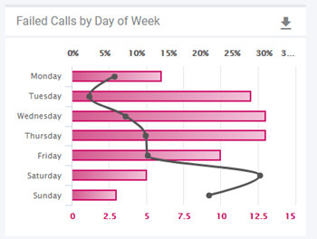
Failed Calls by Day of Week
This chart displays the average of the number of failed calls and the failed call rate for each day of the week in the specified date range:
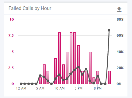
Failed Calls by Hour
This chart displays the average number of failed calls and the failed call rate by the time of day throughout the specified date range:
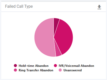
Failed Call Type
This chart displays the number of failed calls and the failed call rate in the specified date range for the failed call types selected on the Dashboard Settings.
All of the charts are interactive. As you move your mouse over a data point, details about the data point are displayed. You can click on a data point to drill down into the data. When you click a data point on any of the charts, the data point is set as a filter on the Filters pane.
Note You can add more than one data point at a time using Shift-click and Ctrl-click (Command-click on the Mac):
- To select adjacent data points, click the first data point, hold down the Shift key, and click the last data point.
- To select non-adjacent data points, hold the Ctrl key down as you click on each data point that you want to include in the filter.
Click Update in the Filters pane to apply the filters and update the dashboard.
You can add as many filters as you want.. For example, you can click a specific date on the Failed Call Volume Trend chart, and a specific time on the Failed Calls by Hour chart. After you click Update in the Filters pane, you can scroll down to see data for each Location for that date and time.